Your Photo is Not a Logo and Here’s Why
 Very few things in life make me sad. Injured puppies, sick babies…the usual. However, in the graphic design world, nothing makes me sadder than a bad logo. Specifically, I’m talking about a logo that’s a photograph. Why? Because, it’s a photograph, not a logo. Here are a few reasons why a photograph doesn’t work for your brand.
1. Details – Depending on the size of your photograph, you will lose details when it is placed in smaller areas. For instance, a business card, with a photograph is going to give you a very small image and potential customers will be squinting to make out the photo details.
2. Resolution Issues – A successful (and useable) logo needs to be exponentially expandable. If you have a photo, the resolution for print is usually 300 dpi. To create a photo that’s large enough to print on a billboard, you would need a much higher resolution, which would require additional software or the help of a digital photographer. Otherwise, you will have a huge mess of pixels and potential customers will be squinting to make out the overall image.
3. Design Limitations – With a photograph, you’re limited. You wouldn’t likely put a photo on a photo. That would look silly. It will also cause difficulty if you are trying to put your logo on apparel or promotional items.
4. A Photo is Not an Effective Brand Identifier – When I see a photograph I can appreciate it, but I don’t necessarily remember it or associate it with anything specific. No matter what your subject is, there are hundreds of other photos of the same thing out there. Looking at an image of a sweat-covered runner in top form makes me think of fitness, but I don’t necessarily know the brand. However, when you see a swoosh, you automatically think of Nike.
Here are some guidelines to help create a successful logo:
1. Keep it Simple Stupid (KISS) – This was our mantra in college. A successful logo should be simple, yet it should stand out enough that anyone can glance at it quickly and identify it as your brand. Buses go by pretty quickly. Know what I mean?
2. Professional Logo = Good Investment – Find a professional designer or an art student to design your logo properly. It’s pretty easy to find a graphic designer who will give you a good deal on logo design these days. I often have clients with smaller budgets, but I’m happy to help them out for the sake of good branding. Make sure the logo is designed with a vector-based program like Adobe Illustrator. Also, the designer should give you a complete logo set, including a color version, a black and white version and a reverse logo (basically a white logo for color or dark backgrounds).
3. Make Designers Happy – Make sure you receive the following files: An EPS of each version (for print) and JPGs or GIFs of each version (for web). This way, when you do any print or advertising, you can just send one of these files to the designer or printer and they can take it from there. They will love you for it.
4. Your Logo Here – The best way I’ve found to describe a successful logo is to picture it embroidered on a hat or golf shirt. Is it simple enough to be readable? Is it the right file type for embroidery? If the logo works there, then it will work anywhere.
I don’t mean to be harsh or to offend your business. I want your brand to succeed. I want designers to rejoice at the ease of working with your files. Take a look at your logo and ask yourself if it really and truly works. If it does, great! If it could better, send me an email and let’s chat.
For some great examples of bad photo logos, head over to yourlogomakesmebarf.com.


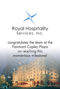
 Don’t worry. It all worked out. Keep an eye out in the Boston Globe either the weekend of June 3rd or the week after for the Fairmont Copley Plaza’s 100th Anniversary special. Congratulations, Fairmont Copley Plaza! And thank you